Malcolm Keith 2026
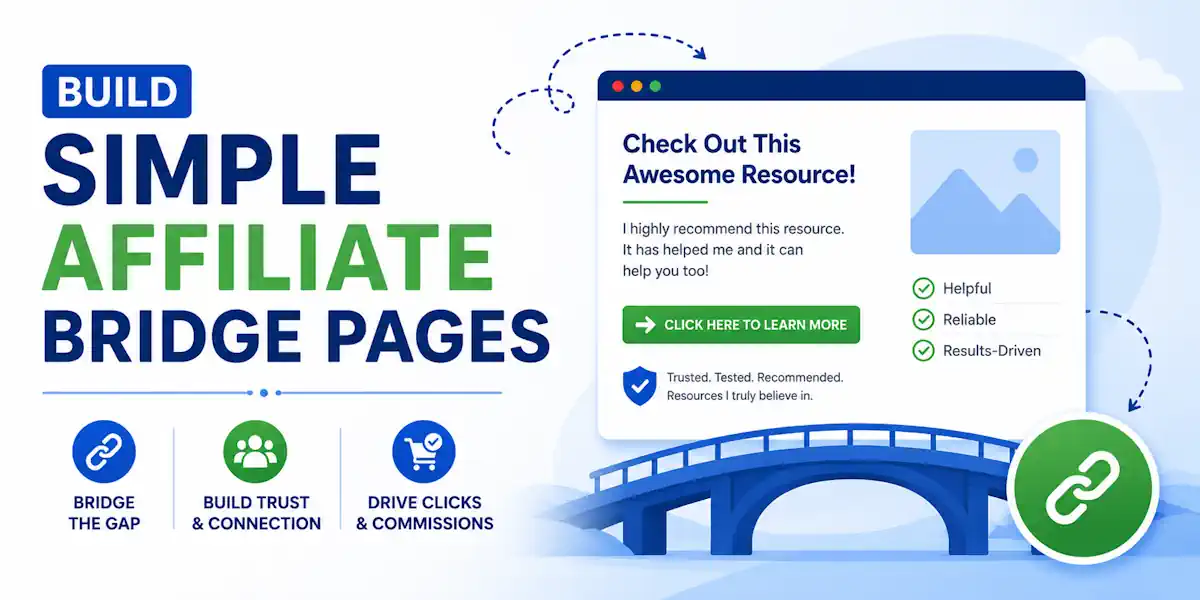
Successful affiliate marketing starts with more than just a link. Sending cold traffic directly to an offer is often like asking for a sale before you have even said hello. A simple affiliate bridge page gives people a reason to trust the next click.
That is why these pages work so well for beginners.
They slow the moment down, frame the offer, and help the visitor understand exactly what they are about to see. When the message is clear, clicks improve and your traffic feels much less wasted.
Let us build one the easy way.
Key Takeaways
- Simplify the Bridge: A bridge page is not a full website; it is a compact, one-page connector designed to frame an offer, clarify value, and build trust before a visitor clicks through to the affiliate site.
- Match the Message: Success relies on alignment; your page copy and tone must match the expectations set by your traffic source (ads, emails, or posts) to prevent drops in trust.
- Focus on Honesty: Avoid over-the-top hype or impossible promises; clear, direct language that explains the product and its target audience is more effective than aggressive marketing tactics.
- Prioritize Performance: Keep your page mobile-friendly, lightweight, and fast-loading, ensuring a seamless user experience that includes a transparent affiliate disclosure.
What an affiliate bridge page does, and what it should never do
A bridge page sits between the traffic source and the offer. Someone clicks your ad, post, email, or video link, lands on your page, and then decides whether to continue to the affiliate offer. As a foundational element of an effective sales funnel, this page serves as a connector rather than a destination.
Simple enough, right? The mistake is turning that page into a cluttered mess.
Your affiliate bridge page is not:
– a full website
– a 20-section homepage
– a place to throw five buttons, three videos, and a countdown timer that screams trust me
It is one short page with one job, which is to move the right person to the next step.
Think of it like a host at the door. A good host does not tackle people and drag them inside. A good host says, here is what this is, here is who it is for, and here is what to expect.
That means your page should match the click that brought them there from your specific traffic source. If your ad mentions beginner-friendly affiliate marketing, the page should keep that same message. If your traffic came from a post about residual income, do not switch gears and lead with aggressive hype.
Depending on your strategy, this might take the form of a simple pre-sell page, a long-form advertorial, or a landing page designed to kick off a webinar funnel.
If the bridge page promises one thing and the offer page says another, trust drops fast.
A strong bridge page also filters out bad clicks. That is a good thing. Not everyone should go through. If the offer is not right for them, it is better to lose the click now than to deal with a refund, complaint, or account warning later.
If you want to see how other marketers describe this page type, ClickBank’s bridge page overview gives a few different ways people use them. The idea is the same in every version, which is to make the next click feel natural.
Start with the offer, not the page builder
Most beginners start with design. That is the wrong order.
Start with the offer itself. Open the sales page to understand exactly what you are promoting. Watch the video, read the FAQ, and review the price comparison if one is available. Check the claims and the tone of the sales page to ensure you are accurately representing the product. Then, ask three basic questions.
Who is this offer for?
What problem does it solve?
What should the visitor understand before they click through?
Those answers shape the whole page.
If you are promoting a training program for beginners, say that. If it is better for people who already have a list or ad budget, say that too. Honesty helps more than hype. This is also where ethical affiliate marketing starts. Don’t promise outcomes the offer doesn’t support, such as “quit your job fast” if the product teaches long-term skill building.
In the home business space, that kind of language burns trust and risks being flagged as thin affiliate content.
If you are using this page to grow an email list, consider offering a lead magnet to provide extra value before the prospect moves to the main offer. A simple disclosure matters, too. Put it where a typical person can see it. Something like, “I may earn a commission if you buy through my link” is clear and direct. No legal fog.
No tiny gray text buried in the footer.
You also need to check the rules where your traffic comes from. Facebook, YouTube, and Google Ads policy guidelines all have their own standards. Some programs don’t allow direct bidding on brand names, and ad platforms often reject misleading claims or fake scarcity.
Read the terms carefully before you send traffic to avoid any compliance issues.
When the offer is clear in your head, building the page gets easier. You are not guessing anymore. You are simply matching the page to the product.

A simple bridge page layout that fits on one screen
Most bridge pages work best when they stay short. On mobile devices, that often means one clean scroll. On desktop, the design should still feel compact and intentional. You do not need a complex landing page builder to achieve this; the best funnel builders for beginners are often more effective because they keep you focused on the user experience.
Here is a basic structure that works for a wide range of affiliate offers:
| Section | What to include | Simple example |
|---|---|---|
| Headline | Match the click and make the next step clear | “See How This Beginner Training Works” |
| Subhead | Add context and set expectations | “Watch the short overview and decide if it’s a fit for you.” |
| Short intro | Two or three sentences, written like a person | “I found this useful because it explains the model in plain English. It is not for everyone, but it is a good fit for beginners.” |
| Benefit points | Three short points, not a giant list | “Good for beginners”, “Simple setup”, “Explains the business model clearly” |
| CTA button | One action only | “Watch the Free Overview” |
| Disclosure | Plain language near the CTA or under it | “I may earn a commission if you buy through this link.” |
That is all you need. Rather than overwhelming your visitor with ten different sections, focus on providing unique content that clarifies the value of the offer. If you want to encourage engagement, you can add simple interactive elements like a short progress bar or a hover effect on your button to grab attention.
If you want a wireframe view, picture the page stacked like this: headline first, subhead under it, one image or short video preview, a short paragraph, three bullets, a single call to action button, then your disclosure. You can include an optional logo at the top and a small footer at the bottom, but keep it simple.
A few headline ideas:
- “Before You Join, Watch This Quick Overview”
- “A Simple Look at This Affiliate Training Program”
- “See What You Will Get Before You Click Through”
A few subheading ideas:
- “This is best for beginners who want a clear starting point.”
- “If you are tired of random tactics, this will make more sense.”
- “Take a quick look first, then decide if it fits your goals.”
And for button copy, plain language wins:
- “Watch the Short Video”
- “See the Training Details”
- “Check the Program Here”
Avoid buttons that sound like a late-night infomercial. Phrases like “Claim your riches now” often trigger suspicion before the visitor even reaches the final sales page. Keep your tone helpful and direct to maintain trust.
Write copy that feels honest, not salesy
Your affiliate bridge page copy should sound like one person talking to another.
Not :
– a billboard.
– a robot.
– a hype machine.
This approach is essential for warming up leads before they reach the main offer.
That means short sentences. Everyday words. One clear thought at a time.
If you have used the product, say what you liked without turning it into a fairy tale. A genuine product review is far more effective than hyperbole. For example, “What I liked most was how simple the setup was” feels normal. “This changed my life forever in 24 hours” does not. You can also incorporate social proof or specific testimonials to build trust, as long as they feel authentic to your audience.
If you haven’t used it, don’t fake it.
You can still write a useful page by saying you’re sharing a resource you believe is worth reviewing. Plenty of people in affiliate marketing wreck their credibility by pretending every offer is their personal favorite.
The best copy on a bridge page usually does four things. It names the problem, points to the solution, sets expectations, and invites the click. Sometimes, this page acts as a simple squeeze page designed to capture contact information for an email list before moving the visitor forward.
Here is a clean example for a beginner-focused business offer:
“Trying to make sense of the industry can feel noisy fast. This training breaks the process down in a simple way and shows what you are buying before you commit. If you want a clearer look at how it works, check out the overview below.”
That kind of copy does not push too hard. It guides. By including honest testimonials, you show that real people have seen results, which helps remove doubt.
You can also reduce weak clicks by adding a small qualifier. Something like, “This is best for people willing to learn and follow a process” helps. It tells the reader this isn’t magic, and it protects you from selling fantasy. Finally, ensure your call to action is clear and direct so the user knows exactly what to do next.
Clear beats clever. People click when they know what’s next.
Need more visual inspiration? This beginner bridge page walkthrough shows the basic flow without getting too advanced. Use it for ideas, not as a script to copy.
Keep it fast, mobile-friendly, and within the rules
A slow page can ruin a good offer. So can a page that looks fine on desktop and falls apart on a phone. Prioritizing a seamless user experience is critical because speed directly impacts your conversion rate.
Keep the design light. Use one main image, not six. Skip background videos unless they help and load fast. Choose a clean font that is easy to read. Make the button large enough for a thumb tap. Leave enough white space so the page does not feel cramped.
Fast pages usually come down to a few simple choices.
Compress images.
Use fewer plugins.
Avoid pop-ups stacked on pop-ups.
Don’t load widgets you do not need.
If the page takes forever to open, people leave before your message lands.
This is especially important for a PPC campaign, where every millisecond of load time affects your bounce rate.
Mobile matters most because so much affiliate marketing traffic comes from phones.
Read your whole page on your own device before you publish it. Is the headline readable? Is the button visible without hunting for it? Does the page feel smooth on a weak connection? If not, trim it. You can even run simple A/B testing on your headlines to see what resonates best with mobile users.
Compliance matters too.
Use clear disclosures.
Don’t:
– hide your affiliate relationship
– make medical, financial, or income claims you cannot back up
– use fake testimonials
– use fake timers unless the deadline is real
– try to cloak a messy offer with a polished page and hope nobody notices.
That is the bigger point. A bridge page should add clarity, not cover up problems. Whether you are driving traffic through long-tail SEO or direct ads, your bridge page serves as a vital step in your sales funnel. It introduces the customer to your value ladder, setting the stage for a lasting relationship.
If the offer page is weak, your bridge page will not save it. If the message is misleading, the extra step only delays the disappointment. Keep the user experience top of mind, match the page to the offer, follow the rules, and let the right people self-select.
Frequently Asked Questions
Do I need a complex funnel builder to create an affiliate bridge page?
No, you do not need complex or expensive tools to build an effective bridge page. Simple tools are often superior because they force you to focus on a clean, fast-loading layout that prioritizes the user experience over flashy design elements.
Can I use an affiliate bridge page to collect email addresses?
Yes, a bridge page is an excellent place to offer a lead magnet or opt-in form. By collecting contact information before sending the visitor to the affiliate offer, you can build your own asset while still facilitating the initial sale.
Why is a disclosure required on my affiliate bridge page?
An affiliate disclosure is essential for both legal compliance and building trust with your audience. It clearly states your relationship with the product, ensuring visitors understand that you may earn a commission, which avoids deceptive practices and potential policy violations.
How long should my affiliate bridge page be?
Your bridge page should be as short as possible to get the job done effectively. In most cases, this means a single, clean scroll on a mobile device that delivers a headline, a brief explanation of the offer, and a single, clear call-to-action button.
Conclusion
A simple affiliate bridge page does not need fancy design or complex copy. It needs one clear message, one honest promise, and one easy next step. By keeping your layout focused, you can effectively direct visitors to the final sales page while maintaining their trust.
Keep your content short and ensure it perfectly matches the offer on the sales page. Make it load fast on mobile devices, include a clear call to action, and always include a real disclosure to stay within the rules of your affiliate program. When the page feels clear and authentic, your conversion rate will likely improve.
Ultimately, success in affiliate marketing comes down to how well you bridge the gap between curiosity and a purchase. Monitoring your earnings per click will help you refine your approach over time. By mastering these basics of affiliate marketing, you ensure that every visitor has a simple, trustworthy path to follow.