Malcolm Keith 2026
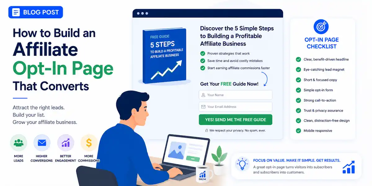
A click is easy to buy, but a subscriber is harder to earn within the world of affiliate marketing.That is why a high-performing affiliate opt-in page cannot be a random squeeze page featuring only a headline, a form, and hope.
An affiliate opt-in page (or lead capture page) is a stand-alone webpage designed to collect a visitor’s contact information (usually an email address) in exchange for a freebie before directing them to an affiliate offer. It acts as a bridge to build your email list while earning commissions
If you want to improve your lead generation results and master the art of email list building, your page must match the intent of the click, make a clear promise, and feel easy to trust.
Let us build one that accomplishes all of those goals.
Key Takeaways About An Affiliate Opt-in Page
- Align your message: Ensure the opt-in page is a direct continuation of your ad or content, as a disconnect between the source and the page leads to high bounce rates.
- Focus on a single goal: Remove all distractions like site navigation and multiple links, keeping the page focused solely on capturing the visitor’s email address.
- Offer a high-value, narrow lead magnet: Provide a quick, useful resource—such as a checklist or template—that solves one specific problem rather than offering a vague or overly complex guide.
- Prioritize mobile and speed: Build for small screens first and minimize technical bloat, as slow-loading or poorly formatted pages discourage visitors from completing the opt-in process.
- Build trust through transparency: Use honest consent language and avoid aggressive marketing tactics to ensure your new subscribers feel safe and are more likely to engage with future affiliate recommendations.
Start with the click, not the page
Most affiliate opt-in pages fail before the visitor even lands on them. The problem is rarely the design; it is a disconnect in your sales funnel.
If your ad, video, email, or social post talks about beginner traffic tips, the page cannot suddenly push a generic business opportunity. If your target audience arrived curious about home business tools, do not offer a broad “make money online” PDF.
That feels like a bait and switch, and people will leave immediately.
Your page needs strong message match. The words, tone, and promise on the page should feel like the natural next step from the pre-sell content that sent the visitor there.
If the click says “low-cost traffic ideas for beginners,” the page should feel like page two of that same conversation.
Here is a simple example.
Say your ad says, “Free checklist: 9 ways beginners can get traffic without burning cash.”
A weak page headline would be, “Join my list for updates.”
A much better headline would be, “Get the 9-Traffic-Source Checklist for New Affiliates.”
Same topic, same intent, no surprise.
This approach also significantly improves your conversion rate. When people opt in for a clear reason, you identify who they are and what they care about. This allows you to generate qualified leads that are much more likely to respond to your future recommendations. Someone who wants traffic help is more likely to engage with traffic tools, training, or tracking software than they would be with a broad, irrelevant pitch.
Keep the page focused on one job: get the opt-in. Do not try to make the sale, tell your whole life story, or include six different product links.
That means removing distractions that split attention, such as full site navigation, sidebars, floating chat widgets, and multiple offers on the same screen.
Think of the page like a hallway, not a shopping mall. One direction. One next step.
Before you write a single line, answer three questions:
- Who clicked?
- What did they expect to get?
- What one action do I want now?
If those answers are fuzzy, the page will be fuzzy too.
Write a promise worth trading an email for
People do not hand over an email address simply because your page exists. They provide it because the offer feels useful, timely, and easy to consume. When crafting your message, your unique selling proposition must be clear, telling the user exactly why your resource is the missing piece to their success.
The strongest lead magnets are narrow. They solve one problem fast and do not sound like homework. A successful affiliate marketing opt-in offer for 2026 usually looks like one of these:
- A short checklist for a clear result
- A swipe file with templates or scripts
- A mini training that fixes one bottleneck
- A buyer’s guide that compares tools or options
For a traffic-focused target audience, these specific assets are significantly stronger than a vague ebook:
- “7 Beginner Ad Angles That Pull Cheap Clicks”
- “Free Link Tracker Setup Checklist”
- “3-Day Follow-Up Email Swipe File for New Leads”
- “Home Business Funnel Audit Sheet”
Your headline should follow the AIDA principle by grabbing attention and sparking interest, clearly stating what the reader gets, who it is for, or what pain it removes. If it tries to sound too clever, it usually gets weaker.
Here are a few headline examples that work:
- “Get the Beginner Traffic Checklist Before You Spend on Ads”
- “Free Mini Guide: Set Up Your First Affiliate Follow-Up Funnel”
- “See the 5 Page Fixes That Lift Opt-Ins on Cold Traffic”
A strong subheadline adds context by answering what the reader will be able to do. For example: “A quick, plain-English guide for new affiliates who want more leads without adding more tools.”
Next is the call to action. Your button should describe the outcome rather than just the action. “Submit” is lazy, and “Sign up” is acceptable but weak. When building a high-converting sales funnel, your call to action should be persuasive and outcome-oriented.
Better call to action examples include:
- “Send Me the Checklist”
- “Get the Free Guide”
- “Show Me the Page Fixes”
- “Start My Mini Training”
Keep it short, direct, and tied to the offer. Finally, do not overbuild your lead magnet. A two-page checklist that gets opened today beats a 42-page guide that gets ignored forever. If the offer feels quick and simple to use, more people will say yes.
Design your affiliate opt-in page for mobile first, speed first, and clarity first
Pretty pages do not always convert. Clear pages do.
Most affiliate traffic now hits on a phone first, even when the sale happens later on desktop. Because of this, effective landing page optimization requires that you build your opt-in page for the smallest screen before you consider the larger one. A mobile-optimized layout is no longer optional. That means using one-column designs, large text, strong contrast, and buttons that are easy to tap without zooming in.
Above the fold, the visitor should see four things fast: the headline, the offer, the form, and the CTA. If your target audience has to scroll to figure out what you are giving away, you are asking for a level of patience that most people simply will not give.
Keep the layout clean. A basic structure often results in a high-converting landing page:
- Headline
- Short subheadline
- Simple form
- CTA button
- Small trust note
That is enough for many pages.
Page speed matters more than people want to admit.
A slow page burns paid clicks and free traffic the same way. Heavy background videos, oversized images, too many scripts, and cluttered builders all add drag. Compress images, use fewer plugins, and skip anything decorative that does not actively help the user opt in.
If you want video on the page, make it short and optional. Do not force autoplay. Do not make the visitor watch two minutes before they can act. Let the page work without the video.
Forms should be short. In most cases, email only works best. If you want first-name personalization for follow-up emails, test name plus email against email only. Do not guess.
The page should also feel easy to scan. Use short lines and leave space around the form. When you focus on a mobile-optimized experience, keep supporting copy tight. A crowded page feels like effort, and effort kills conversions.
Add trust without adding friction
Visitors are cautious now, and for good reason. They know an email address opens the door to more messages. Your page should make that feel safe, not slippery.
Trust signals don’t need to be flashy. In many cases, small cues work better than big claims. A short privacy note under the form helps. So does a clear line about what they will receive.
Try something like: “You will get the checklist and occasional emails about traffic tools and training. Unsubscribe anytime.”
That is plain, honest, and enough for most pages.
Social proof can help too, but only if it is real.
If you have actual subscriber feedback, a short testimonial, or evidence that the lead magnet has helped people, use it. If you do not, skip the fake polish. Empty badges and made-up claims do more harm than good.
Be careful with income talk. If your opt-in page connects to affiliate marketing, home business, or residual income offers, do not promise results you cannot support. “Build passive income fast” sounds like a warning label now. A calmer promise wins more trust: “Learn a simpler traffic setup for your first funnel.”
Compliance matters here. Use clear consent language and ensure GDPR compliance by linking to your privacy policy. Do not pre-check boxes. Do not hide the fact that you will email them. When you recommend an affiliate link in later emails or on bridge pages, disclose that relationship in a clear way.
That approach does not weaken conversions. Instead, it filters for qualified leads who are more likely to trust you later.
One quiet killer is asking for too much too early. Phone numbers, company names, budgets, or custom question boxes might work for high-ticket applications, but they do not belong on most opt-in pages. If the lead magnet is small, the form should be small too. Keep the trade simple.
A sample affiliate opt-in page you can model
Here is a clean structure that works well for paid traffic, social posts, or YouTube clicks. If you are short on time, you can also look into done-for-you pages to jumpstart the design process.
| Page section | What it does | Example |
|---|---|---|
| Headline | States the main promise | “Get the Beginner Traffic Checklist Before You Buy More Clicks” |
| Subheadline | Adds context and audience fit | “A quick guide for new affiliates who want better leads from low-budget traffic.” |
| Form | Collects the minimum info | Email only (choose between single opt-in or double opt-in settings) |
| CTA button | Tells them what happens next | “Send Me the Checklist” |
| Trust note | Reduces hesitation | “You will get the guide and occasional emails. Unsubscribe anytime.” |
| Light proof | Supports the offer | One short testimonial or creator note |
| Optional FAQ | Handles basic objections | “Is this for beginners?” “Do I need paid ads?” |
This structure keeps the page moving forward so there is no menu, no giant wall of copy and no random banners or an intrusive affiliate link fighting for attention.
If you want to improve results after launch, track the page like a grown-up business, not a guess.
By using the best click tracking tools for affiliates makes it easier to spot which traffic source, headline, or button gets real subscribers.
Always ensure you are using a clean tracking link to monitor your traffic, as this data is essential for accurate email list building. If you notice a specific tracking link is underperforming, you can quickly pivot your strategy.
Use this short checklist before you publish:
- Match the page to the traffic source and your specific promise.
- Lead with one clear benefit, not a broad pitch.
- Keep the form short to protect your conversion rate.
- Make the page easy to scan on a phone.
- Cut slow scripts, heavy media, and extra links.
- Add a plain privacy and consent note.
- Use a clear call to action that describes the result.
- Focus on landing page optimization by testing one change at a time, not five at once.
- Ensure your call to action button stands out visually to drive more clicks.
A simple test plan goes a long way. Start with the headline, your button text, and the form fields. Those three changes often move the needle faster than a total redesign. Keep your affiliate link placement intentional and always test your flow before going live.
Frequently Asked Questions About Using An Affiliate Opt-in Page
Should I use single or double opt-in for my list?
While single opt-in provides higher immediate sign-up numbers, double opt-in ensures your list is composed of more engaged, high-quality subscribers who are less likely to flag your emails as spam. For most affiliate businesses, the increased deliverability and list quality of double opt-in are worth the slightly lower conversion volume.
How many form fields should I include on my page?
Keep your form as short as possible, typically asking for only an email address. Asking for extra information like a phone number or company name creates friction and significantly lowers your conversion rate unless it is absolutely necessary for your specific lead qualification process.
Does the layout of my landing page really affect conversion rates?
Yes, a clean, distraction-free layout is essential for guiding the visitor to the call to action. By using a simple, one-column structure that displays the headline, offer, and button above the fold, you remove the guesswork and make it as easy as possible for the user to convert.
Can I include affiliate links on my opt-in page?
It is generally best to avoid including affiliate links directly on your opt-in page to prevent splitting the visitor’s attention. Instead, use your opt-in page to secure the lead, and then introduce your affiliate recommendations in the ‘thank you’ page or within your follow-up email sequence.
Final thoughts on using an affiliate opt-in page
A high-converting affiliate opt-in page is not magic. It is the result of a tight match between the initial click, your promise, and the next step in the user journey. By mastering the fundamentals of lead generation, you ensure that your efforts in affiliate marketing translate into tangible growth.
When your page is fast, clear, mobile-friendly, and honest, more visitors turn into subscribers. Improving your conversion rate starts with prioritizing email list building as a core asset, ensuring every visitor understands the value you provide. Remember that a high-converting landing page relies on a clear, compelling call to action that guides users exactly where they need to go.
Build your affiliate opt-in page for clarity first, then test and iterate from there to maximize your results.
How to Build a Simple Affiliate Bridge Page
LeadsLeap Marketing Platform Is A Game Changer For Online Marketing